Philosophy
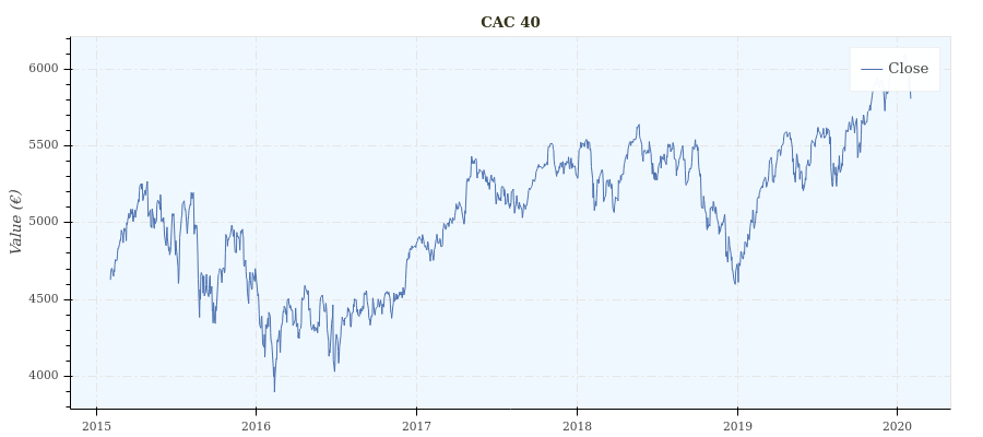
When I approach a data-science problem, I need to plot the data to develop my intuition. I plot graphs – a lot of them. Few months later, when I come back to this problem, I often find on my disk graph like this:
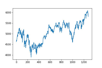
There are two main problems with this graph: it is not contextualized, and not interactive.
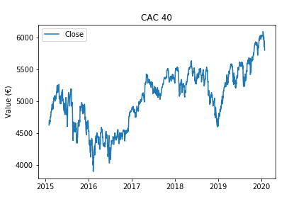
Saving interactive plots from matplotlib seems like a relatively painful hack. Contextualize graph is easy:
import pandas as pd

# 'https://query1.finance.yahoo.com/v7/finance/download/%5EFCHI?period1=1422835200&period2=1580601600&interval=1d&events=history&crumb=mv7passRdUF'
df = pd.read_csv('cac40.csv')

plt.figure()
dates = pd.to_datetime(df['Date'].values)
plt.plot(dates, df['Close'].values, label='Close')
plt.legend()
plt.title('CAC 40')
plt.ylabel('Value (€)')
plt.show()
Even if matplotlib’s API design is remarkable by its capacity to be incredibly flexible while remaining simple, visualization routine in matplotlib still requires boiler-plate code. That’s where seaborn comes in. Seaborn is built on the top of matplotlib and “provides a high-level interface for drawing attractive and informative statistical graphics” (seaborn website). Seaborn reduces the verbosity of the API for usual statistical graphs, while improving their attractiveness. Seaborn has been a source of inspiration for depict.
import seaborn as sns
sns.set()

sns.lineplot(x=pd.to_datetime(df['Date']), y='Close',  data=df).set_title('CAC 40')
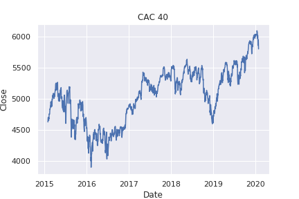
Seaborn also brought the idea that a pandas dataframe must be nicely integrated with a visualization library as it is a standard way of manipulating time-series in the data-science ecosystem.
The historical data of the french CAC 40 looks nicer but it still can’t be kept interactive while saved on disk.
Enter Bokeh.
Bokeh is a web based visualization library, first released in April 2013. The interactive graphs can be saved in a stand-alone html and rendered in the browser. As a consequence, they can be integrated to emails, Confluence, web-based reports, etc. I’ve been seduced by this versatility.
from bokeh.plotting import figure, show

plot = figure(x_axis_type='datetime', title='CAC 40', y_axis_label='Value (€)')
plot.line(x=pd.to_datetime(df['Date']), y=df['Close'].values, legend_label='Close')
show(plot)
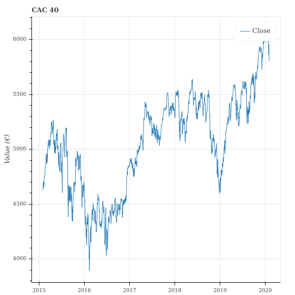
The graph looks clean while the API is fairly concise and simple. However, I thought that I would be ready to limit the possibilities with respect to the graph customization, in order to have an even simpler API. For example, the fact that we have to create a figure, add elements to it (line, points, text, etc) and then, in a third step, display it, enables us to combine graphs together, or display several elements on the same graph. But most of the time, I want to create a figure, add elements of the same type, and obviously display it. I wanted to design an API centered on simple visualization routines. Basically, I wanted to provide a one-line access to the most common types of graphs. More complex graphs must obviously still be accessible, but they might require more graph tweaking.
That is where I introduce depict. Depict is built on the top of Bokeh and essentially, simple graphs can be made simply. The price you pay for that is the numerous opinionated defaults that are set for you. As an example, you cannot change the color of the title, or set a different color for the line around a point and the filling color of this point.
depict.line(x='Date', y='Close', source_dataframe=df, title='CAC 40', y_label='Value (€)')
To by-pass the existence of a figure on which you add elements, I introduced the sum of graphs. I’ve also tried to guess what the user is trying to achieve by automatically parsing dates when they are provided as strings for example. The price for this is that the implementation of all the cases is opaque to the user. For the dates, the used don’t know if the parsing will consider that the time-zone is UTC or not. Also, how will the date ‘10/11/12’ be parsed? Understand dates when they come as strings means that you need to make some arbitrages that will be mostly hidden to the user. In fact, due to the possible interaction of various arguments, documenting all the cases is tedious and would lead to a complicated documentation.
To partially address this issue, I plan to implement a warning system, that would communicate with the user. For example, when an ambiguous date like ‘10/11/12’ is found, the user should be alerted to explain how it has been parsed and how he could act on it. The user should be able to deactivate the warnings for production and also to deactivate only some of them. Some king of verbosity level in fact.
Depict is still very young. It already contains: several high-level features (sum of graphs, automatic colorbars, etc), three types of graph (line, point, histogram), a continuous integration framework based on travis, a documentation based on Sphinx and hosted on readthedocs.
During the next months, it will include: more types of graphs (depict.distribution (1 dimensional distributions with kde estimation), depict.heatmap, depict.boxplot, depict.pie, depict.vertical_line, depict.horizontal_line, depict.text). The gallery and examples will also grow along the way.