Histogram
Signature
-
depict.histogram(y, x=None, source_dataframe=None, tick_label=None, label_orientation='horizontal', width=900, height=400, description='', title='', x_label=None, y_label=None, show_plot=True, color=None, colorbar_type='auto', legend='auto', bar_width='auto', alpha=1, x_axis_type='auto', y_axis_type='auto', x_range=None, y_range=None, save_path=None, grid_visible=True)¶ Plot a graph with points (scatter-plot)
Parameters: - y (array-like of dimension 1 or dict key or pd.dataframe col name) – The height of each bar in the histogram. The values can be either numbers, or dates (datetimes or parsable strings). If a source_dataframe is given, x and y should be column names / keys.
- x (array-like of dim 1 or None or dict key or dataframe col name) – The x-coordinates of the center of the bars of the histogram. If None and source_dataframe not is a pandas dataframe: range(len(y)) is used as x. If None and source_dataframe is a pandas dataframe: the index of the dataframe is used as x. The values can be either numbers, or dates (datetimes or parsable strings). If a source_dataframe is given, x and y should be column names / keys.
- source_dataframe (None, Pandas DataFrame or dict) – Input data as Pandas DataFrame or dictionary. If it is a Pandas DataFrame, and x is None, the index of the dataframe is used as x
- tick_label (str or array like of str) – Labels for each bar. If tick_label is an array like, its length must be the same as the number of bars. Consider the argument label_orientation
- label_orientation ({'horizontal', 'vertical'}) – Orientation of the labels
- width (int) – The width of the graph, including any axes, titles, etc
- height (int) – The height of the graph, including any axes, titles, etc
- description (str) – HTML-formatted text that will be kept bellow the graph. It generally includes metadata, details about the, graphs, etc. It will be kept when the graph is displayed, exported or rendered in a grid with other graphs. If The graph is summed with other graph, their metadata will be concatenated (adding a new line between both)
- title (str) – Title of the graph. The attributes of the title (font, etc), cannot be tuned directly in depict
- x_label (None, str) – Label of the x-axis
- y_label (None, str) – Label of the y-axis
- show_plot (bool) – Whether or not the graph must be displayed immediately after its creation. Notes: The plot object will be returned regardless this parameter. Saving the plot is independant from this parameter.
- color (None, str, array-like) – If None, the first color of the palette is used. If string, a color name is expected (hexadecimal, RGB, and usual colors are accepted (like ‘red’, etc)), and it will be the same for all the bars. If array-like, the length of color should correspond to the number of bars, they will correspond to each bar respectively
- colorbar_type ({auto, categorical, continuous}) – If ‘auto’, the best type will be chosen wrt the data. If categorical: a legend will be used, not a colorbar. If continuous, a colorbar will be displayed on the right side of the plot. The data defining the color must be passed in color
- legend ('auto', array-like) – If auto, the legend will be set when a Pandas DataFrame or a dictionary is provided (the name of the columns / keys will be the legend). If array-like, the length of legend must match with the number of bars drawn
- bar_width ('auto', Number, t-delta, array of number or t-delta) – The width of the bars (the total width). If ‘auto’: the bar_width will be defined smartly considering the minimum distance between 2 bars so that they do not overlap. If Number: The absolute value that holds for all the bars If timedelta: The absolute value that holds for all the bars, only for datetime axis. If array-like of Number or timedelta: The width of each bar is defined separately
- alpha (Number, array-like) – Alpha value of the bars. If Number: it will the same for all the bars. If array-like: its length must match with the number of bars drawn. They will correspond to each bar respectively. alpha=1 means no transparency, alpha=0 means completely transparent.
- x_axis_type ({'auto', 'numerical', 'datetime'}) – Type of the axis. If ‘auto’, the type will be set automatically based on the data provided. If ‘numerical’, ‘datetime’, the type is set accordingly.
- y_axis_type ({'auto', 'numerical', 'datetime'}) – Type of the axis. If ‘auto’, the type will be set automatically based on the data provided. If ‘numerical’, ‘datetime’, the type is set accordingly.
- x_range (array-like) – Range of the x-axis
- y_range (array-like) – Range of the y-axis
- save_path (None, str) – If None, the graph is not saved. If str, the graph is saved in html at the given path. If the html extension is missing, it will be added automatically
- grid_visible (bool) – Whether the background grid must be displayed. In depict, you cannot have further control about the background grid
Returns: depict.plot
Examples
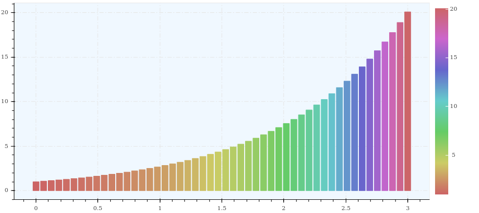
import depict
import numpy as np

x = np.linspace(0, 3)
y = np.exp(x)
depict.histogram(x=x, y=y, color=y)
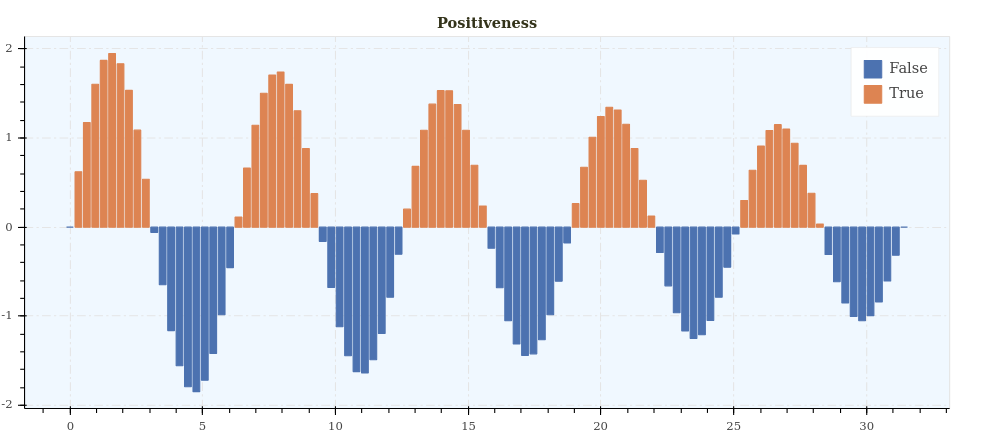
import depict
import numpy as np

x = np.linspace(0, 10 * np.pi, 100)
y = np.sin(x) * np.linspace(2, 1, 100)
depict.histogram(x=x, y=y, color=y > 0, title='Positiveness')